

Flexible Web Design Explained: Benefits and Best Uses

Over half of global website traffic now comes from mobile devices, making flexible web design more important than ever. Businesses and creators face the challenge of building sites that look great and function smoothly across phones, tablets, and desktops. By understanding how flexible web design works, you can make smart decisions that keep your website accessible, attractive, and ready for every user.
Table of Contents
- Defining Flexible Web Design Concepts
- Core Principles Of Flexible Layouts
- Flexible Design Versus Fixed Approaches
- Practical Benefits For Small Businesses
- Potential Drawbacks And Common Challenges
Defining Flexible Web Design Concepts
Web design has evolved dramatically with technology, creating innovative approaches to building websites that adapt seamlessly across different devices and user experiences. Flexible web design represents a sophisticated strategy for creating digital platforms that respond intelligently to varying screen sizes, user interfaces, and interaction methods.
According to Wikipedia, responsive web design (RWD) is an approach that ensures web pages render well across various devices by utilizing fluid grids, flexible images, and CSS3 media queries. This technique allows websites to automatically adjust layout, content, and functionality based on the user's device screen size - whether that's a smartphone, tablet, laptop, or desktop computer.
Flexible web design encompasses two primary methodologies: responsive design and adaptive design. While these approaches might sound similar, they have distinct technical implementations. As defined by Wikipedia, adaptive web design (AWD) involves creating multiple versions of a web page tailored to different devices, serving the appropriate version based on user-agent detection. This means the website prepares distinct layouts for specific device types in advance.
Key characteristics of flexible web design include:
- Automatic content resizing and repositioning
- Consistent user experience across devices
- Optimized performance for mobile and desktop platforms
- Dynamic image and media scaling
- Intelligent navigation menu transformations
Choosing the right flexible design approach depends on your specific business needs, target audience, and technical requirements. Small businesses benefit most from responsive design, which provides a more fluid and universally compatible solution without requiring multiple pre-built page versions.
Core Principles of Flexible Layouts
Flexible web layouts are the architectural foundation of modern digital experiences, enabling websites to gracefully adapt across an increasingly diverse range of devices and screen sizes. Modular design stands at the heart of this approach, allowing web developers to create responsive interfaces that seamlessly transform without losing functionality or visual appeal.
According to research from ArXiv, modular responsive web design using element queries enhances flexibility by allowing modules to adapt their design based on local context, promoting reusability and modularity. This means each component of a webpage can independently adjust its layout and presentation, creating a more intelligent and dynamic user interface.
As documented by KLIC, responsive web design techniques involve creating flexible web layouts that adapt to various screen sizes using CSS frameworks and media queries. These techniques ensure that websites maintain their aesthetic integrity and functional performance across smartphones, tablets, laptops, and desktop computers.
Key principles of flexible layouts include:

- Grid-based design with proportional sizing
- Fluid image and media scaling
- Breakpoint optimization for different device types
- Contextual content repositioning
- Performance-focused code structuring
Successful flexible layouts prioritize user experience by ensuring that content remains readable, navigation stays intuitive, and visual design remains consistent regardless of the viewing device. Small businesses can leverage these principles to create professional, adaptable websites that look great everywhere.
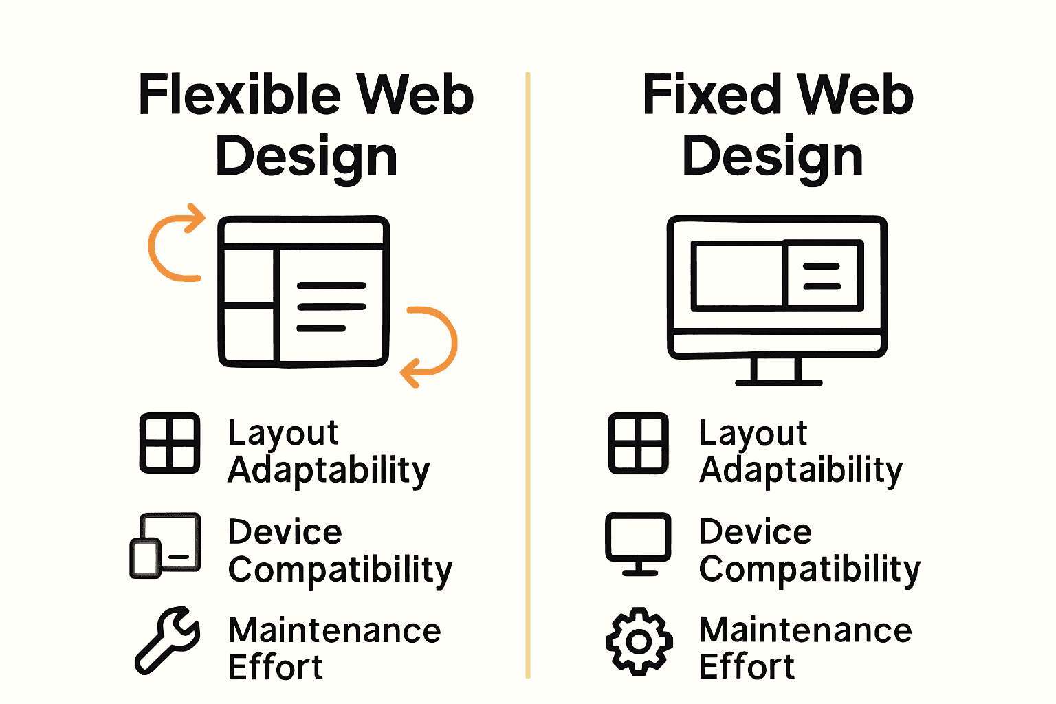
Flexible Design Versus Fixed Approaches
In the rapidly evolving digital landscape, web design approaches fundamentally differ between flexible and fixed methodologies. Fixed design represents a traditional approach where websites maintain a rigid, predetermined layout that remains constant across all devices, while flexible design introduces dynamic adaptability that transforms user experiences.
Research highlights an interesting challenge in design flexibility. According to Wikipedia, the flexibility–usability tradeoff principle suggests that as a system's flexibility increases, its usability may potentially decrease due to added complexity. This means designers must carefully balance adaptability with intuitive user experience.
An emerging perspective from ArXiv suggests that an aspect-oriented, model-driven approach can improve device-aware web services by enabling flexible adaptation to various devices, directly contrasting with traditional fixed designs. This approach allows websites to intelligently restructure content and layout based on specific device characteristics, screen sizes, and user interaction patterns.
Key differences between flexible and fixed design approaches include:
Here's a comparison of flexible and fixed web design approaches:
| Feature | Flexible Web Design | Fixed Web Design |
|---|---|---|
| Layout Adaptation | Responsive Dynamic scaling | Static Fixed dimensions |
| Device Compatibility | All devices Mobile & desktop | Limited Usually desktop only |
| User Experience | Consistent Adaptive navigation | Consistent only on one device |
| Maintenance | Lower Single codebase | Higher Multiple versions |
| Performance | Optimized for devices | Can be slower on mobile |
| Initial Cost | Moderate Single site | Low But may need redesigns |
- Responsive layout versus static positioning
- Dynamic content scaling versus fixed-width elements
- Device-adaptive interfaces versus uniform presentation
- Performance optimization across platforms
- Enhanced user experience through intelligent design
Small businesses benefit most from flexible design strategies that prioritize user accessibility, ensuring their digital presence remains professional and engaging across smartphones, tablets, and desktop computers. By embracing adaptable design principles, companies can create websites that look impressive and function seamlessly regardless of the viewing device.
Practical Benefits for Small Businesses
Small businesses operate in a competitive digital landscape where every interaction counts. Flexible web design emerges as a critical strategy that transforms how these organizations connect with potential customers, offering far more than just an attractive website.
According to research from ArXiv, implementing modular responsive web design allows small businesses to create adaptable web applications that cater to diverse devices, significantly enhancing user experience. This means a local bakery, consulting firm, or service provider can maintain a professional online presence that looks equally impressive on a smartphone, tablet, or desktop computer.
As documented by KLIC, responsive web design techniques enable small businesses to develop flexible web layouts that adjust to different screen sizes, improving accessibility and reach. This approach directly translates to practical business advantages: more potential customers can easily access information, increasing engagement and potential conversions.
Specific benefits for small businesses include:
- Cost-effective single website design instead of multiple platform versions
- Improved search engine rankings through mobile-friendly design
- Higher user engagement across different devices
- Reduced maintenance overhead
- Professional brand perception
By investing in flexible web design, small businesses can compete more effectively in the digital marketplace. The ability to present a consistent, high-quality user experience regardless of device type becomes a powerful tool for building trust, attracting customers, and driving business growth.
Potential Drawbacks and Common Challenges
While flexible web design offers numerous advantages, it's not without significant technical and strategic challenges that can impact small businesses' digital strategies. Design complexity and performance optimization emerge as critical considerations that require careful navigation and expert implementation.
According to Wikipedia, increasing a system's flexibility can lead to decreased usability due to added complexity, posing substantial challenges in design and user experience. This means that as websites become more adaptable, they risk becoming less intuitive or harder to navigate, potentially alienating users who prefer straightforward interfaces.
Research from ArXiv highlights that developing flexible web services requires addressing challenges such as maintaining performance across devices and managing increased development complexity. Small businesses must carefully balance the desire for comprehensive adaptability with the practical limitations of resources, technical expertise, and user experience design.
Common challenges in flexible web design include:
- Performance overhead from complex responsive scripts
- Increased development and maintenance time
- Potential inconsistencies across different device types
- Higher initial design and implementation costs
- Technical complexity requiring specialized skills
Successful implementation requires a strategic approach that prioritizes user experience, carefully weighs technical trade-offs, and remains focused on delivering clear, accessible digital solutions that meet business objectives without overwhelming potential customers.
Unlock the Full Power of Flexible Web Design for Your Small Business
If you've been exploring the advantages and challenges of flexible web design, you already know how important it is to create a website that adapts smoothly across all devices while maintaining top performance and ease of use. The article highlights pain points like balancing design flexibility with usability, optimizing across smartphones and desktops, and tackling the complexity that can come with responsive or adaptive layouts. At Lakeview Web Dev, we understand these challenges and specialize in building fully hand-coded, mobile-responsive websites crafted from scratch — no page builders, no cookie-cutter solutions.
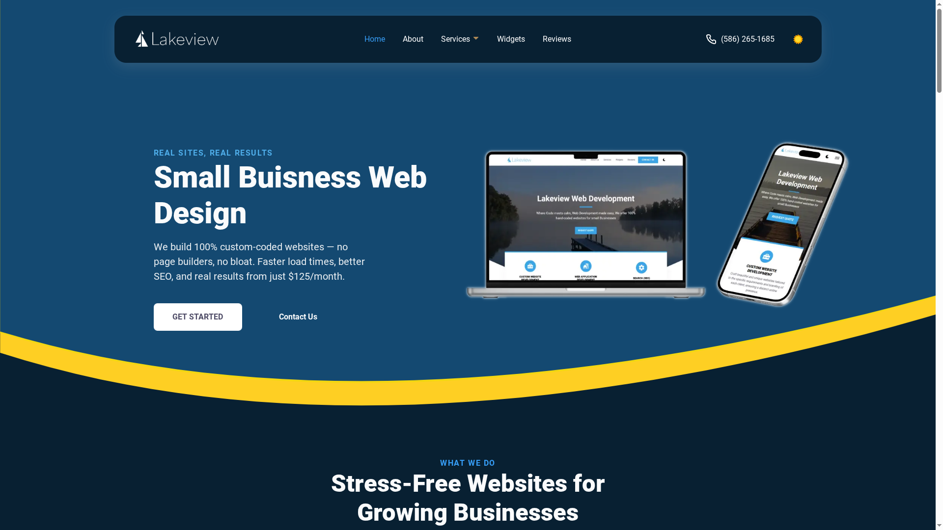
Ready to turn flexible design concepts into a reliable, high-speed website that truly reflects your brand and works flawlessly for your customers? Visit our custom web development services to see how we deliver seamless mobile performance, SEO optimization, and ongoing support for small businesses like yours. Don't wait until your competition adapts — get a website designed to grow with your needs now. Check out our offerings and contact us today to start building your future-proof online presence.
Frequently Asked Questions
What is flexible web design?
Flexible web design is an approach to creating websites that adapt automatically to different screen sizes and devices, ensuring a consistent user experience across smartphones, tablets, laptops, and desktops.
What are the benefits of using flexible web design for small businesses?
Flexible web design offers small businesses cost-effective solutions by allowing them to maintain a single website that is mobile-friendly, improves search engine rankings, increases user engagement, and reduces maintenance overhead.
How does responsive web design differ from adaptive web design?
Responsive web design uses fluid grids and CSS media queries to alter the layout and content dynamically, while adaptive web design serves distinct versions of a webpage tailored for specific devices based on user-agent detection.
What are the common challenges associated with flexible web design?
Common challenges include performance overhead due to complex responsive scripts, increased development and maintenance time, potential inconsistencies across devices, and the need for specialized technical skills to implement effectively.